I'm Henry, a design leader in consumer electronics focused on building better, smarter, and more sustainable products through design thinking.
INDUSTRIAL DESIGN
HARDWARE
UI/UX
COLOR, MATERIAL & FINISH
Let’s get in touch!
henry.homza@gmail.com
My Work
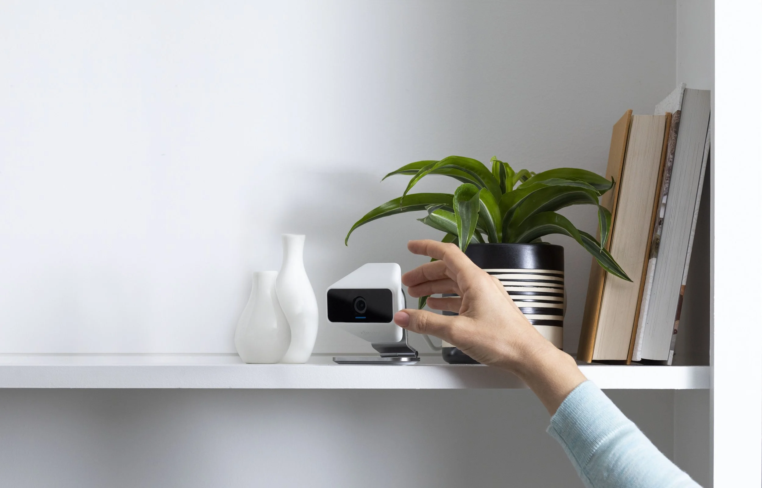
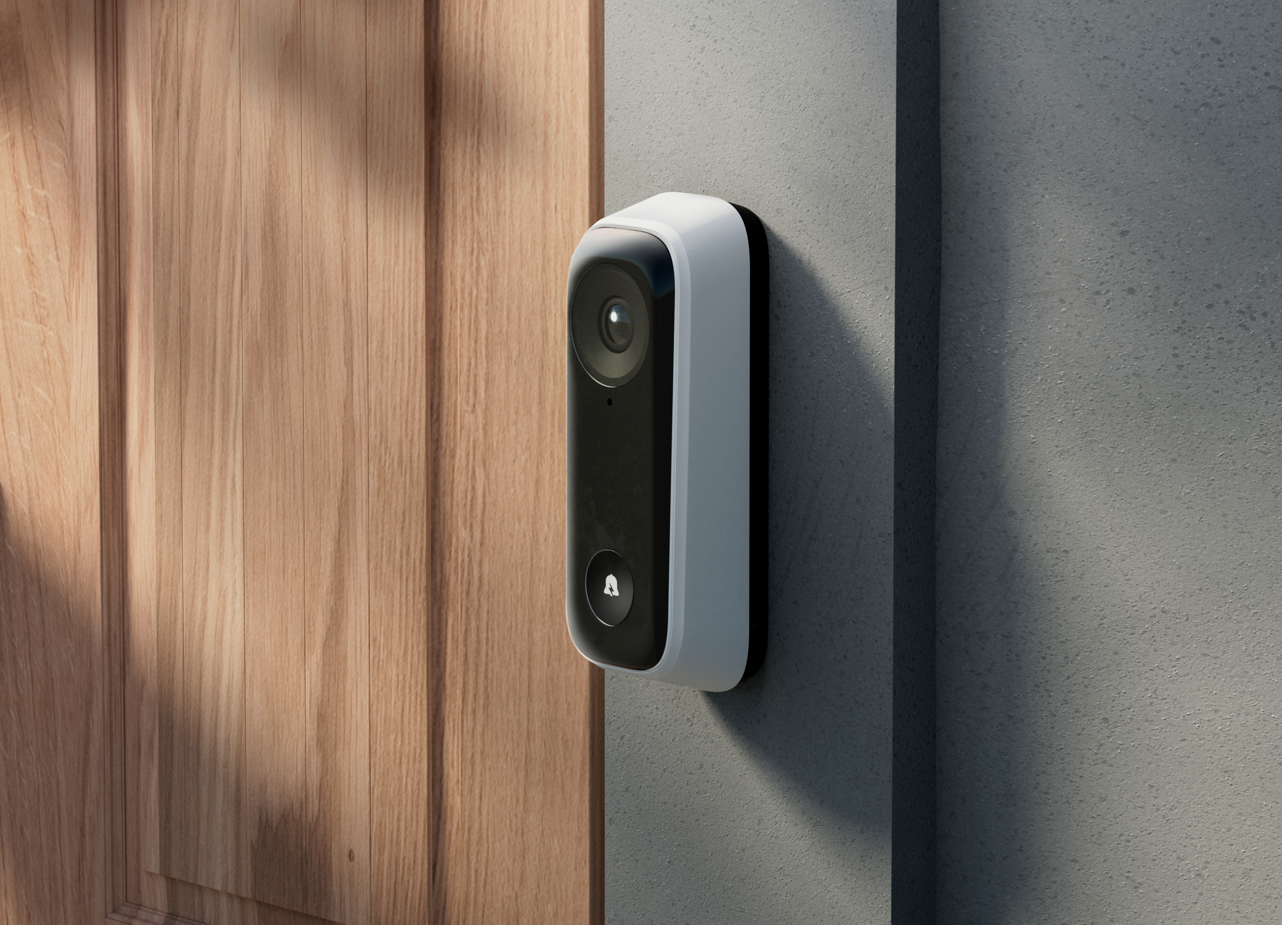
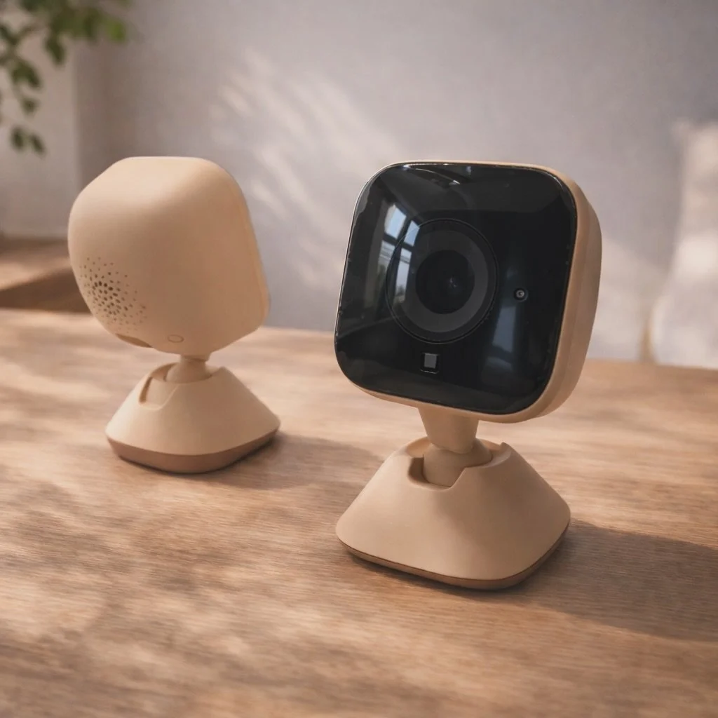
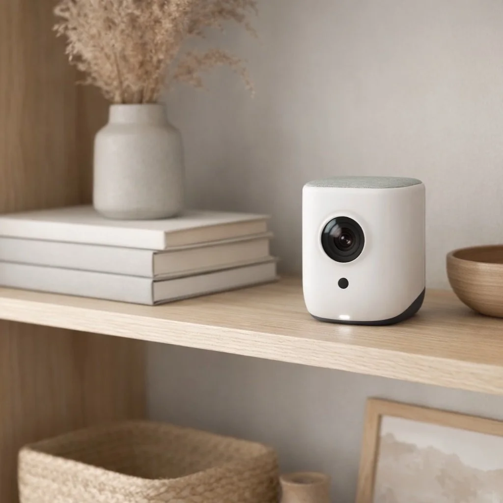
xCam2 began with a single principle: adaptability. Most cameras force users to adjust to them. xCam2 reverses that relationship. Its three-point articulated stand and wide 124° field of view were designed to respond to real environments, not dictate them. Every design decision served one idea: empowering users with control, so the product fits their workflow instead of the other way around.
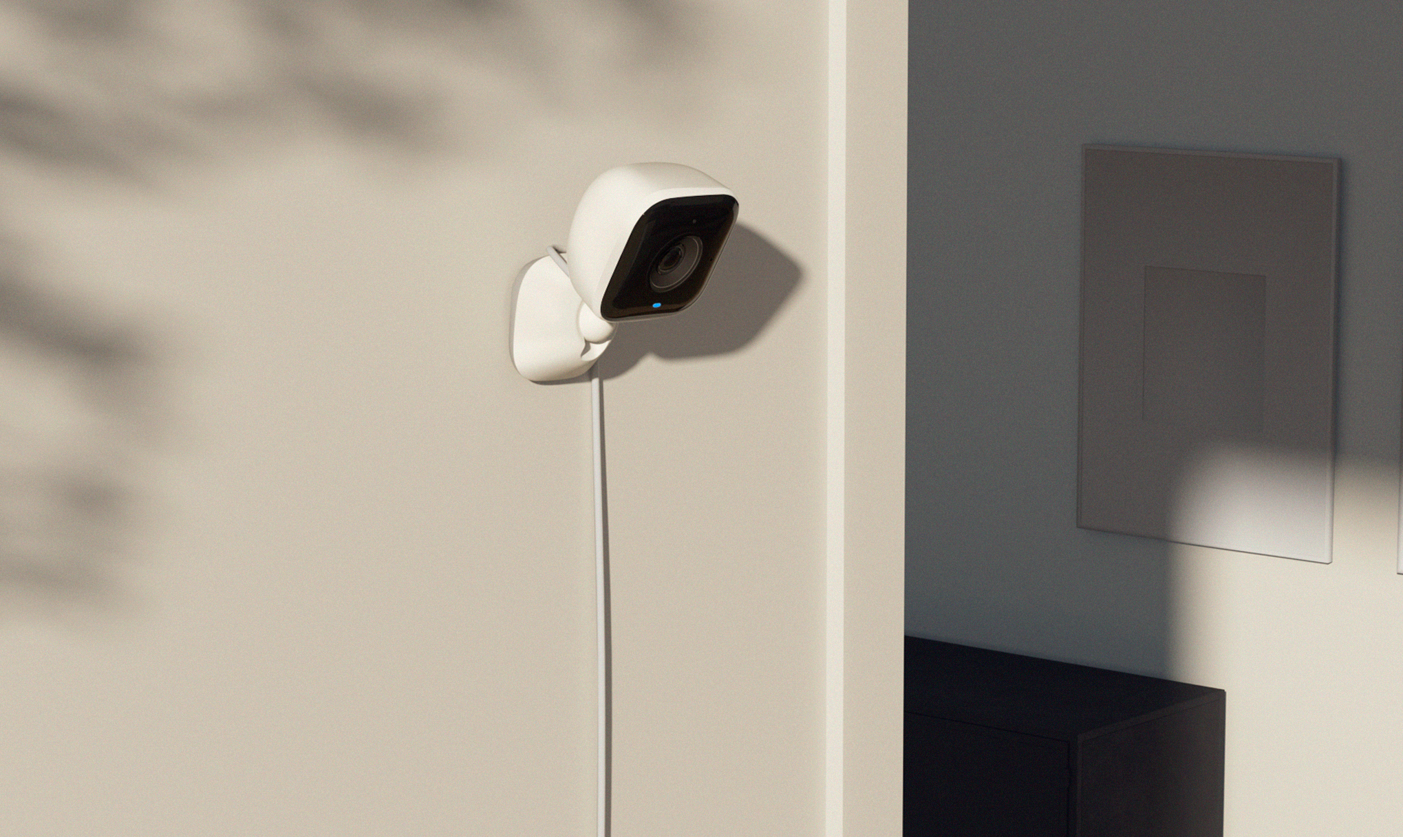
This camera was designed to disappear in plain sight. Its rounded form and soft white finish let it live comfortably in any environment, from a nursery wall to a garage shelf. The intent wasn’t to make it decorative, but to make it belong. Every curve and surface reflects a sense of calm neutrality, showing that good design doesn’t have to stand out to make an impact.
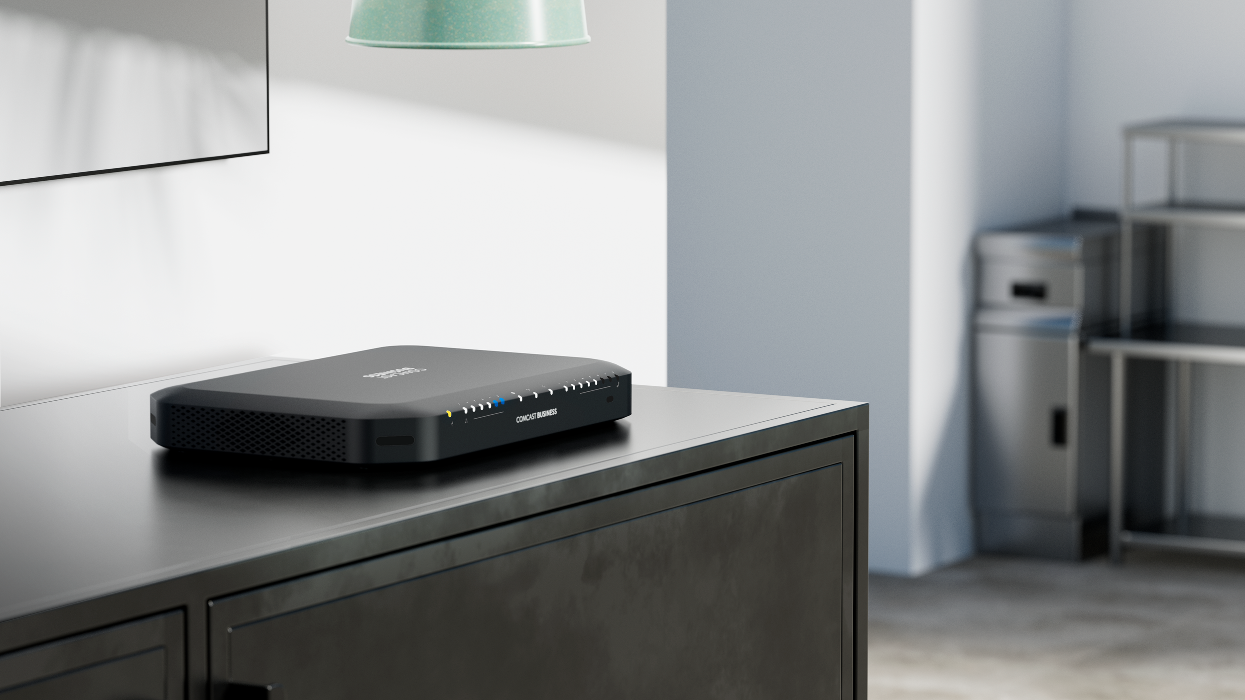
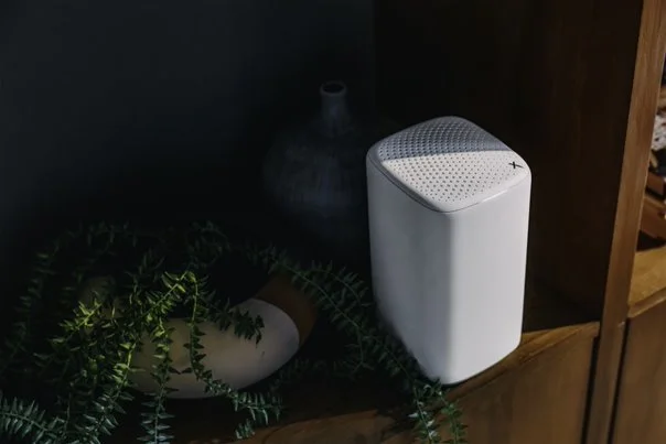
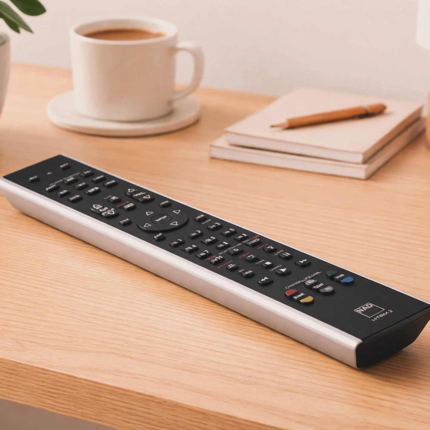
CBR2 was designed for modern workspaces where technology blends into the environment rather than competing with it. The form expresses quiet capability, it’s balanced, composed, and intentional. Every surface was refined to project stability and purpose, reflecting a broader philosophy: that performance and presence should support, not distract, from the work being done.
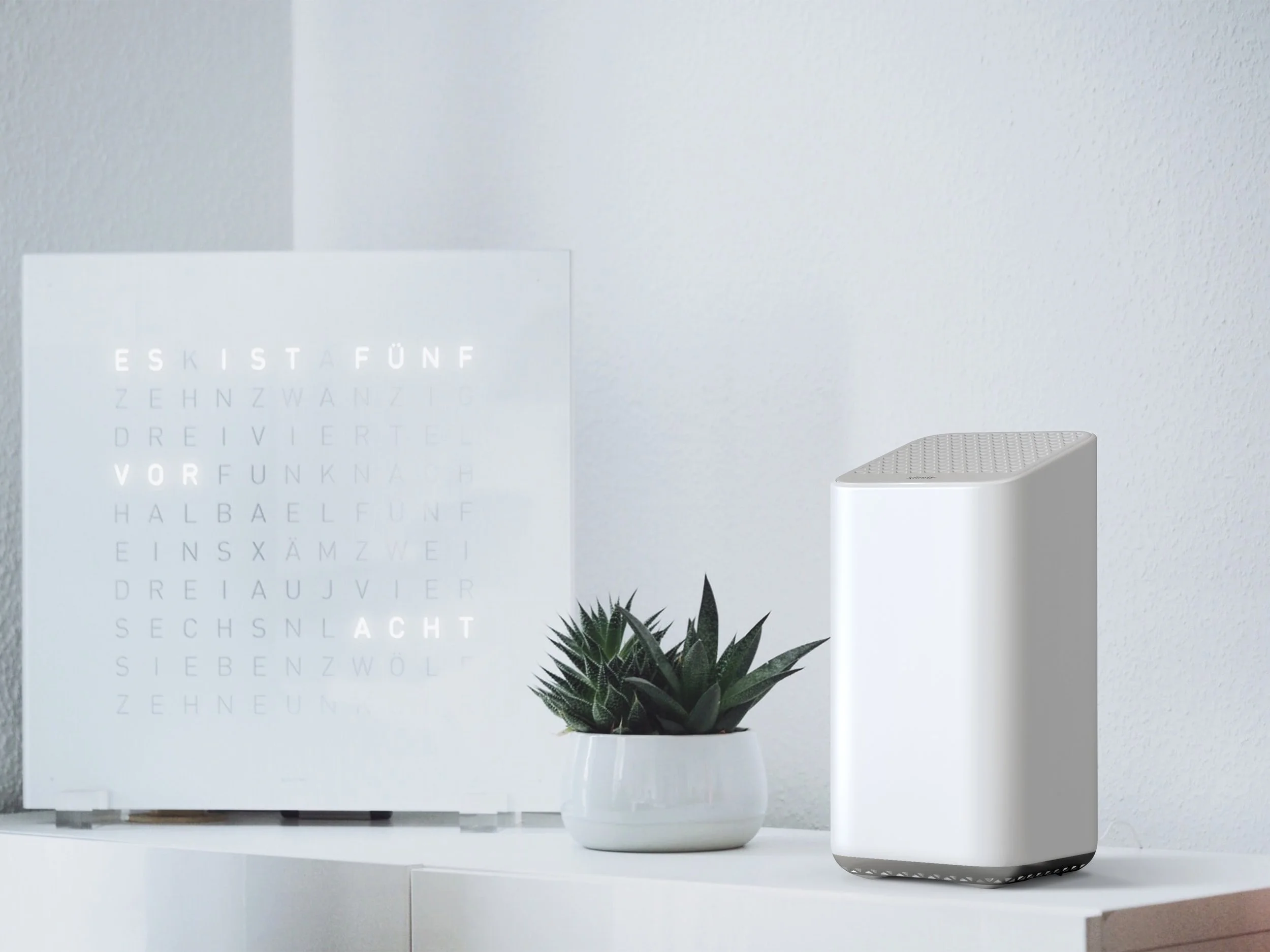
The Wi-Fi 6 xFi Gateway was built to last, physically and visually. In Comcast’s leasing model, products must endure years of use without feeling temporary. The design answers with quiet strength: clean lines, deliberate geometry, and a calm presence that fits naturally into the home. It proves that durability and design integrity don’t have to compete; they can coexist with purpose.
Other Works
For a look at what I’ve been working on lately or to get a feel for how my design process works, check me out on Instagram. I’ll be posting behind-the-scenes projects and showing off some of the creative stuff I’ve been diving into.


